STAPORT started with a simple belief: the bottle you carry every day should feel as considered as anything else you own. The founders had a beautiful product, a matte bronze bottle made in France, but no brand to match it and a generic online store that undersold its quality.
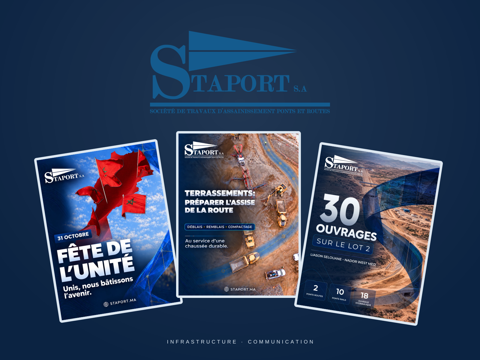
Make complex infrastructure work clear and engaging. A strong navy palette, bold type and project photography give STAPORT’s communication a consistent and confident presence.


The original post designs present roads, bridges, hydraulic structures and site operations, alongside company and national occasion messages. Repeated layouts and concise hierarchies keep the content recognisable across subjects.
The new e-commerce experience puts photography first, with lifestyle imagery and material close-ups leading each page. Since launch, STAPORT has seen a clear lift in conversion and a growing community of loyal customers.